5 Outdated Home Decor Trends You Don't Want In Your House
Home is more than a spot to rest your head. It's a sanctuary, a memory palace, and a place to express your inner self. That's why society loves to reinvent the standards of interior design as we ourselves grow and evolve. But does that mean you have to redo your whole house when trends shift? Of course not. If you're content with your home, then dust off your hands — the job is done. No list of hot-or-not design fads needs to dictate your happy place. However, if you feel like something needs to change, it could be time to break out of your comfort zone and shake up your space with exciting new ideas. Which brings up the next question: what kind of decor trends do you want to invite into your house?
When it comes to interior design, think carefully about what speaks to you. When you're feeling stymied and uninspired, it's easy to fall prey to popular designs just because they're all around you. It's classic peer pressure. But sometimes, those all-my-friends-are-doing-it decor tricks are the last things you want, because they're obvious, insincere, and, frankly, going out of style. Like, do you really need a Himalayan salt lamp? Ultimately, if you're looking for a breath of fresh air, here are a few too-popular home decor trends you should think twice about.
Sterile kitchens
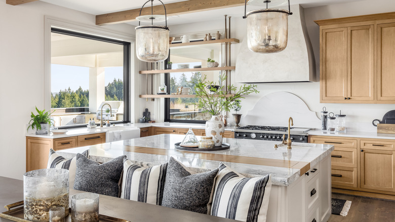
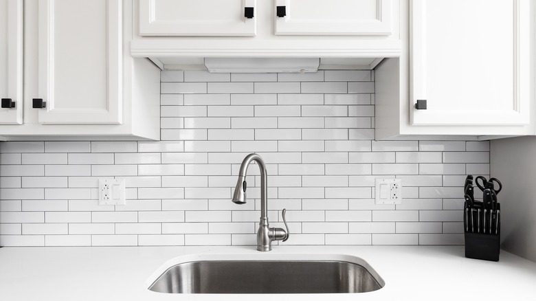
There's no denying that all-white kitchens have had a moment. This color-free color scheme reflects light like no other, making even the smallest kitchen spaces seem bright and airy. However, this trend has become so ubiquitous that the wow moment has worn off, and all-white kitchens are more likely to come across as cold and uninviting than refreshing.
"All-white kitchens can feel very sterile and flat," home decorator Lyndsey Scott tells Camille Styles. "Having little diversity and void of personality, they lack the ability to evoke an inspiring emotion." For so many families, the kitchen is the heart of the home. So do you really want to sacrifice warmth and comfort to keep it looking spotless as a doctor's office?
To shake things up, consider approaching your kitchen design with an eye for texture and contrast. You can still keep some elements white for that clean finish, like trim and cabinetry. But try complementing white cabinets with a vivid tile backsplash, wood or stone countertops, eye-catching drawer pulls, and pops of color in your decor. If you want to get exotic, there are even ways to successfully incorporate animal print in your home. Whatever your preferred aesthetic, the end goal for any kitchen should be creating an inviting space that lures people in.
Cheap furniture
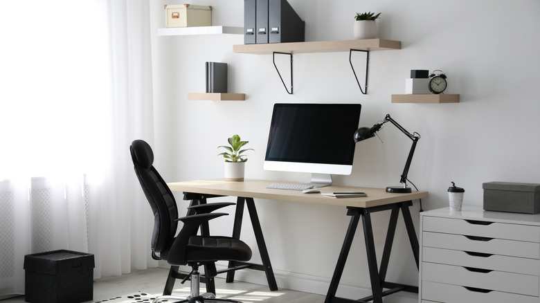
High-quality furniture can be expensive, and you may be hesitant to drop a lot of money on that coffee table or bookshelf for fear that it may soon look cliché and outdated. But it's time to stop turning to cheap furniture as a substitute. Cheap furniture — sometimes called "fast furniture" for the same reason we consider trendiness and poor construction to be hallmarks of "fast fashion" — simply isn't built to last (via Architectural Digest). Often, fast furniture cuts corners with subpar materials like easily-destructible particle board and peel-prone laminate. So even if you still love the design, natural wear and tear mean that cheap furniture will need to be replaced in a few short years.
But what if you're the type who likes to regularly mix it up and redecorate with new pieces? Fast furniture still isn't the best way forward. For one thing, every time you replace a piece, you'll be more likely to simply throw out the last one. After all, what's the resale value on a build-it-yourself flatpack computer desk? So you toss it, contributing to the growing issue of furniture and decor waste, which represented over 12 million tons of trash in 2018 (via the United States Environmental Protection Agency).
Instead, consider seeking out vintage furniture at thrift stores, flea markets, or antique bazaars. Vintage items offer quirky personality and longevity, and depending on the item, you may be able to get a good deal. So you can make your home something special without breaking the bank or crowding your rooms with cheap spacefillers.
Farmhouse typography
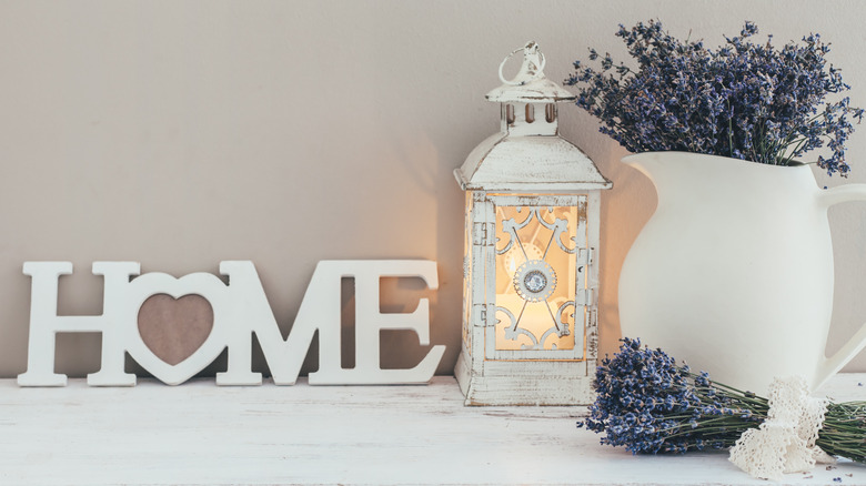
Just a few short years ago, Joanna Gaines of "Fixer Upper" fame had us all wondering, "Who doesn't need a vintage sign?" Whether you embraced this trend with faux-rusted stamped metal declaring your kitchen a source of "Farm Fresh Milk" or painted your own inspirational block letters on a repurposed shipping pallet, the farmhouse typography fad spread like wildfire. Now, we've reached peak farmhouse, and the pendulum is finally swinging away from rustic signage. Not to throw shade at their great prices, but when you can start buying a decor piece for ten bucks at Aldi, that's probably a sign that the style has saturated the market and lost all character.
For art pieces that deliver similar visual impact without the passé lifelessness of "Live, Laugh, Love," explore prints with deep color saturation or stark contrast. If you still want to incorporate typography, you can — just veer toward more modern fonts and unique quotes or phrases. For an ultra-cool twist, you can even consider custom neon signs, which are a growing trend to watch. "We're talking about beautifully photographed neon signage that pops off the wall," DROOL Art founder Alex Liepman tells The Zoe Report. "It's all about striking the right balance, so if you're looking for a subtle yet eye-catching pop of color that can perfectly transform a room without hurting your eyes, then look no further."
Horizontal shiplap
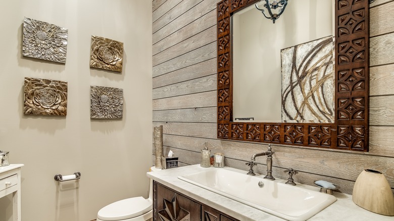
With its meteoric rise to popularity over the last decade, horizontal shiplap could easily be considered a holy grail of modern interior design. But now its star is falling, and for one primary reason: overuse. Holding the power to transform almost any space, shiplap has proliferated to the point of being utterly expected and unremarkable. This is a shame, because the shiplap trend was genuinely beloved, gracing rooms with an instantly homey feel. "Although I personally like the look when appropriate, I think the trend is going to play itself out by 2022, if it hasn't already," designer Amanda Thompson tells Real Homes.
So what are some alternative ways to add dimension and texture to your walls, without falling into an outplayed fad? Try framing your walls with trim and molding. This vintage throwback can evoke anything from a classy, Austen-era drawing room to the excessive opulence of Versailles, making it adaptable all along the spectrum between restraint and maximalism. Plus, trim is an inexpensive way to create interest in a room lacking design details and can be incorporated in a variety of layouts and scales. Or, if you're absolutely married to the idea of shiplap, consider installing it with a vertical alignment, which is less overused and will draw the eye upwards to add the illusion of height to your space.
Boho wall hangings
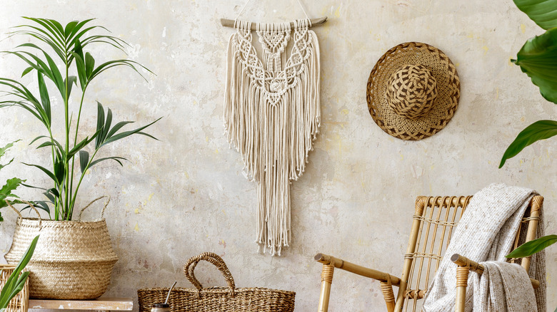
Looking for a way to complement your army of houseplants and capture a bohemian vibe? In recent years, wall hangings have been a go-to staple for the contemporary starchild. From A-line falls of knotted macrame to those inescapable buntings depicting the phases of the moon, super-casual wall hangings have been all over our social feeds. But now, those hangings are going out of vogue.
As interior designer Caitlin Wilson tells Forbes, "A trend that I'd love to see go away and stay away, is the 70s-inspired wall-hangings. They remind me of adult-size mobiles. As much as I love textiles, I really think they can be better appreciated in the form of a Persian rug or a beautifully embroidered pillow and not as a dust collector over your bed or living spaces." So if you adore textiles as art pieces but want to incorporate them in a way that's more functional and less twee, try treating your living space to beautiful linens and soft furnishings, instead.
